Hello my name is Pui, I am a web developer based in London.
Linglau.com: A new responsive portfolio
11 May 2012
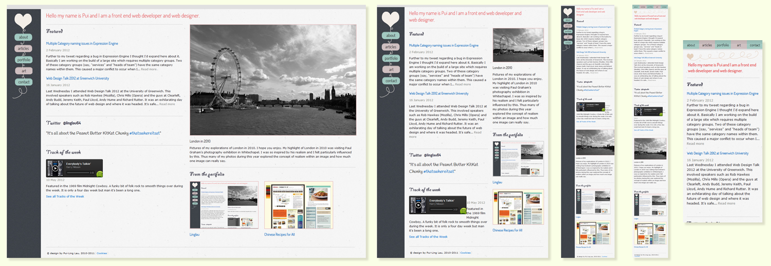
As of May 2012, linglau.com has become bigger and better and even more responsive. My last redesign was in February of this year, which wasn’t long ago. However I have learnt a lot since that time and so decided to redesign. The functionality of the site has also much improved. This will be my third redesign of the site, you can view its iterations in all its glory.
In terms of its responsiveness, I designed the site with max-widths of 1200px, 768px, 480px and 320px. In essence, three of those widths have the same design with shifting content and the 320px has a different design to compensate for the smaller browser width.
The Designer and the Developer
By setting out the design beforehand (in Illustrator CS5), it felt a lot more succinct when coding the breaking points, as opposed to winging it when it comes to the build. As always a strong well-planned, wireframed and thought-out design does wonders.
As a designer and a developer, I (literally) put on different hats when I’m creative and when I’m building (not really). But I do tend to separate the two personalities. My developing side is the most prominent and is pretty much my day job. The designer in me roars out at random times and it cannot be stopped (call me Dr Banner).
It’s the same principle for when you end up with a project that you design AND develop. If the design is strong than you will be well informed when it comes to the build and can make the right calls. You’re in essence project-managing yourself and your different ‘personalities’.
Workflow: Bruce Banner and the Hulk must get along
This management is even more important when it comes to responsiveness. It’s no longer one design and one width, it’s multiple designs and widths with various obstacles along the way. If anything your two personalities have to work together harder than before and you’ve got to satisfy the hulk within you.
I’ve yet to build a responsive site as part of a project-managed team but it will be interesting to see how the workflow will work. You can no longer segregate the designer and the developer like a cookie cutter conveyor belt stamping out your websites.
Content is King: He rules, he really does
It’s not just the designers and the developers either. Lorem Ipsum just doesn’t cut it anymore. Ever. Even in design. And with responsiveness, the whole idea is that your content will shift, change and morph to make it easier for your user experience. What good will Lorem Ipsum do when it comes to content that will move unpredictably? Content ruled the kingdom before, it now rules the universe.
Say no to complacency, not strangers..
So I say this each time but I have really enjoyed redesigning this site. I’ve learnt much and am satisfied with this than any of my previous versions. Having said that, complacency is my biggest fear, hence the monster in me ripping out every couple of months. Expect much posting of shenanigans and tutorials to come. It’s going to be another exciting three months.